Ette Dermatology Boutique - Rebranding // Brasil
PT/BR
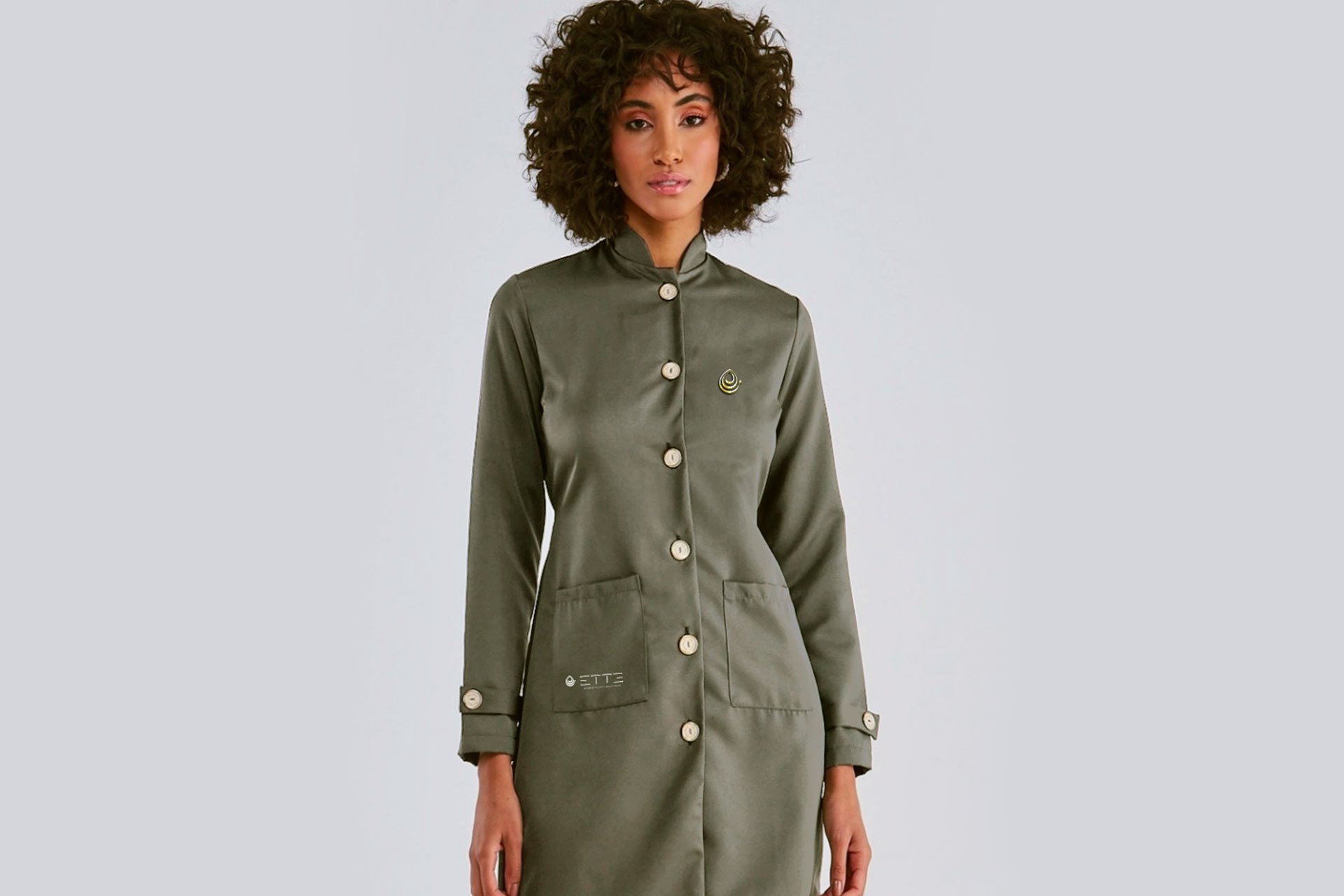
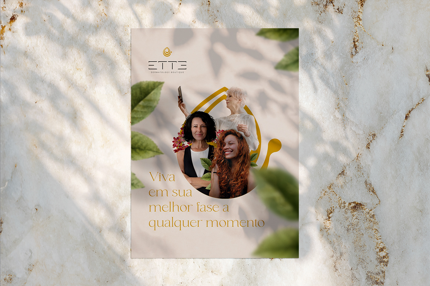
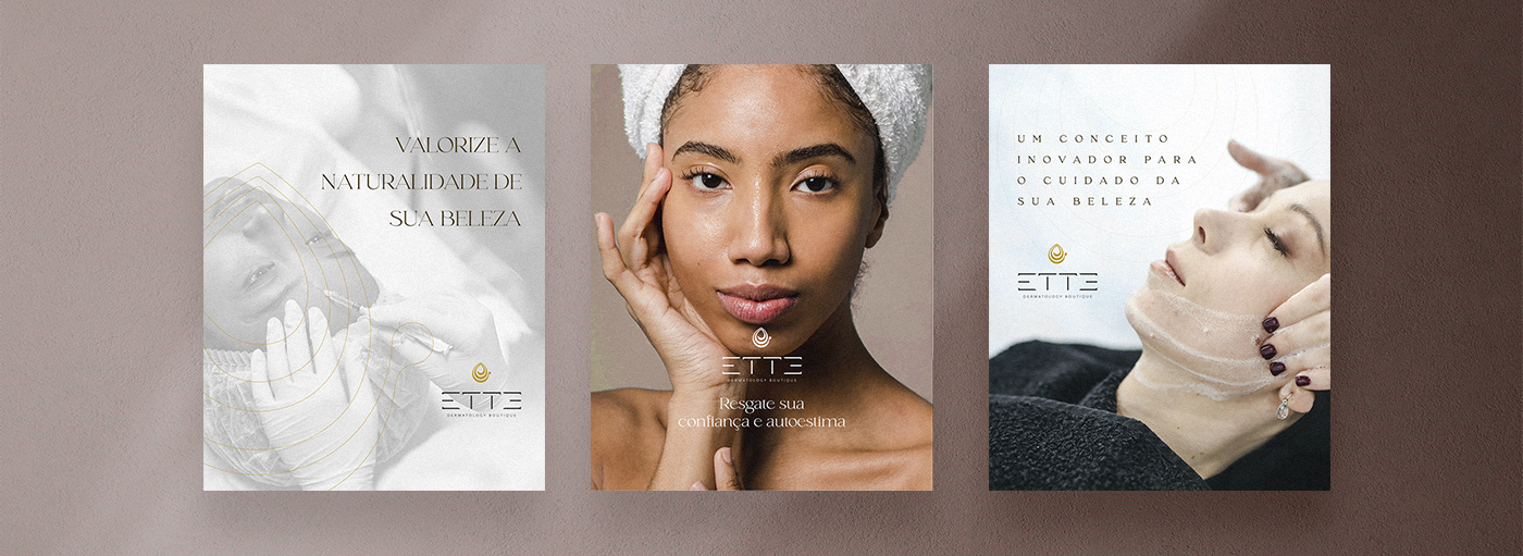
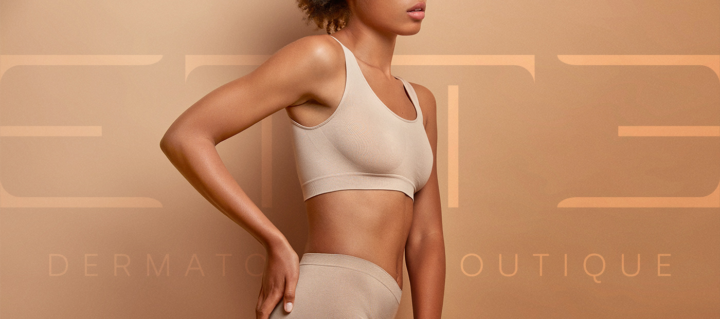
Com tecnologia, inovação e sofisticação, Ette Dermatology Boutique vem para oferecer o que há de mais avançado no universo dermatológico para pacientes seletos e que prezam pelo melhor atendimento, resultado e conforto.
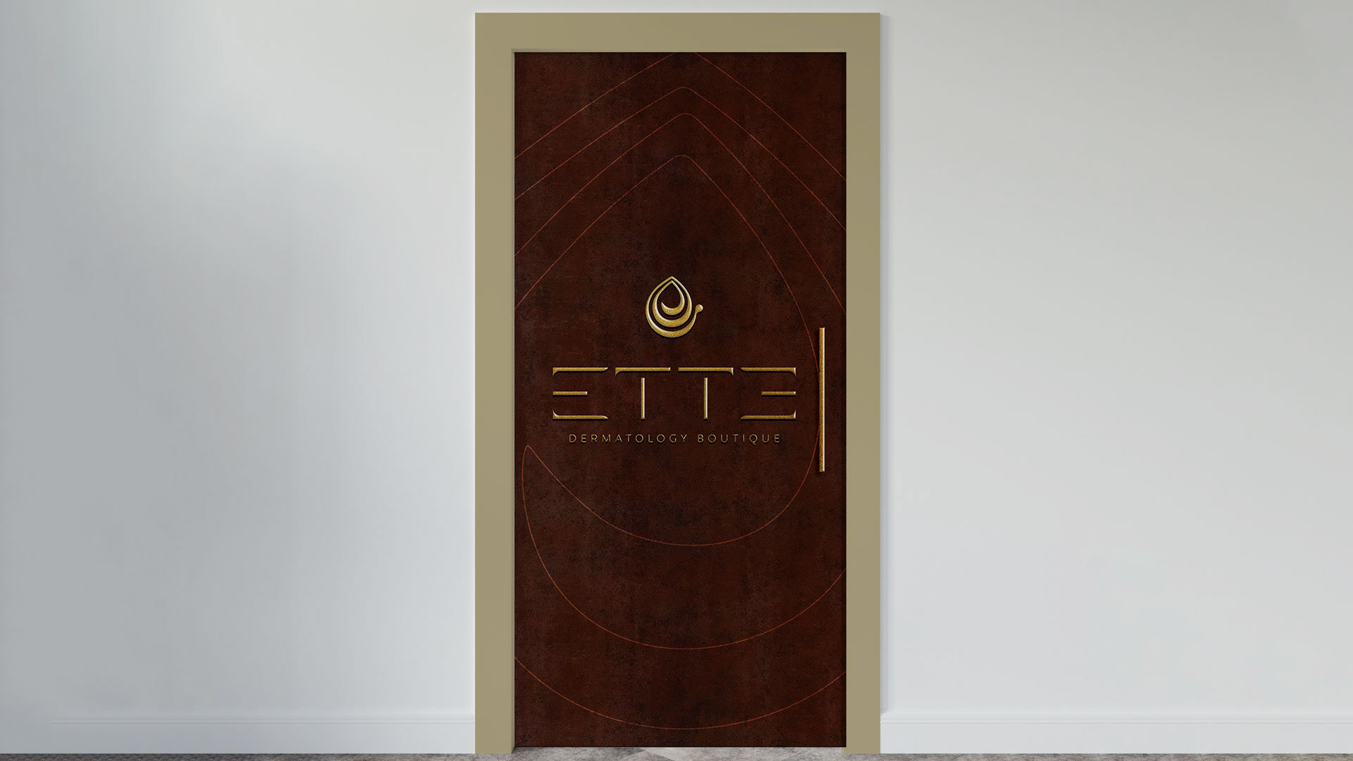
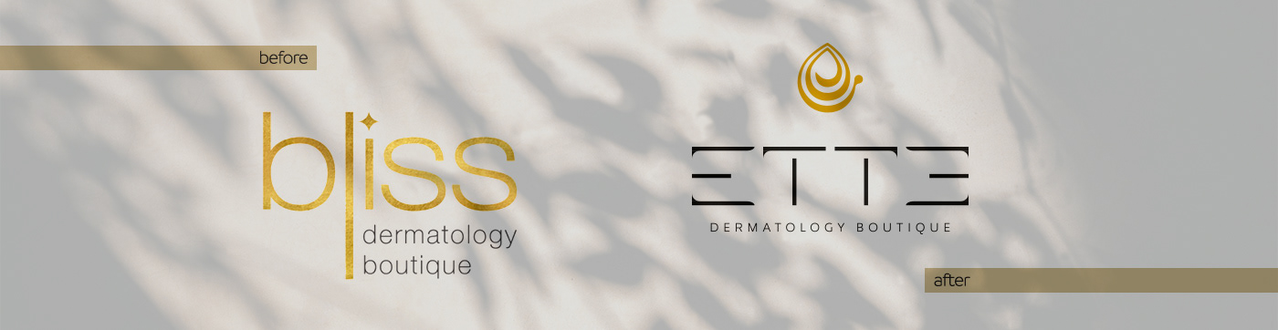
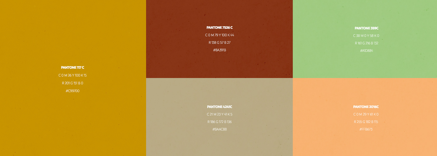
O objetivo da identidade visual é representar de forma direta o glamour e luxo do espaço, atribuindo valor agregado, bom gosto, sutileza e modernidade. Seu naming e um palíndromo, podendo ser lido em ambos os lados, tendo a mesma leitura e sonoridade, representando de forma límbica a melhor versão de seus pacientes por dentro e fora.
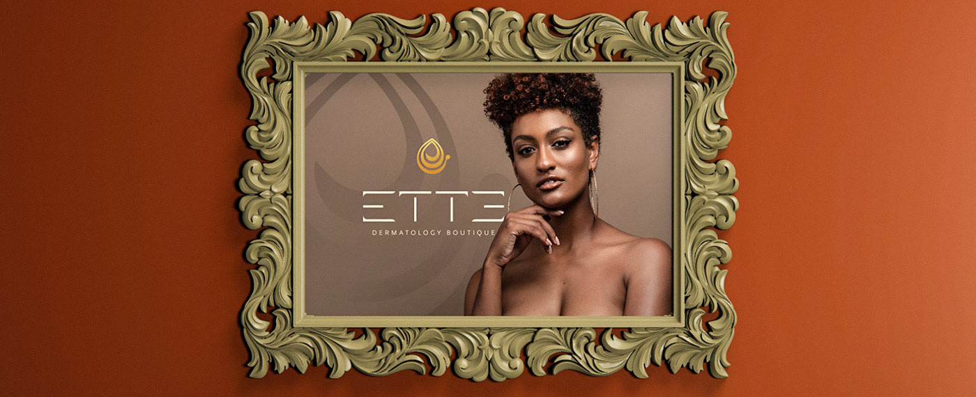
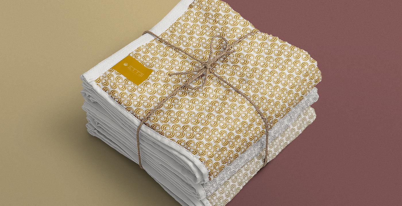
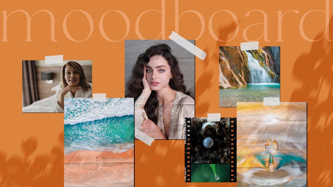
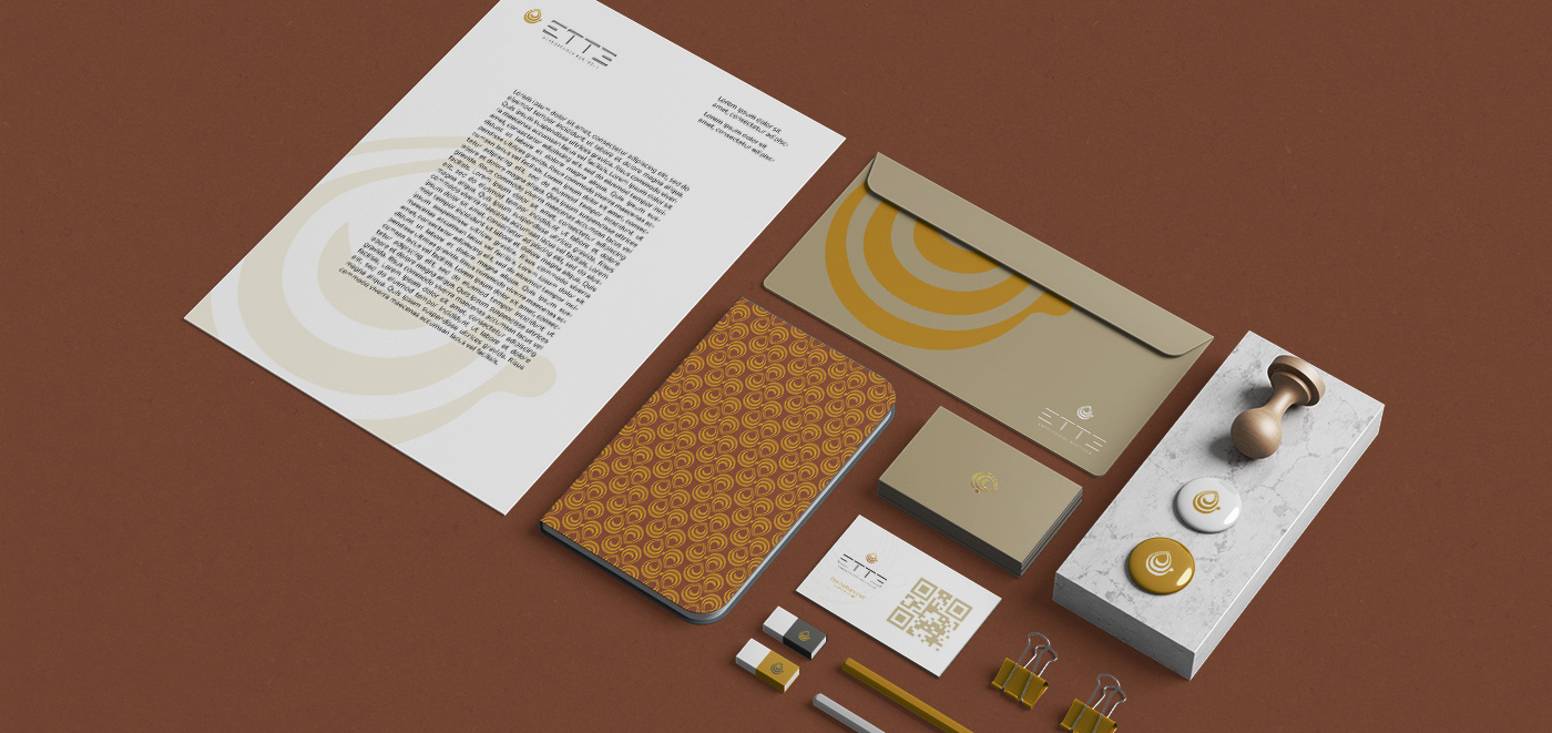
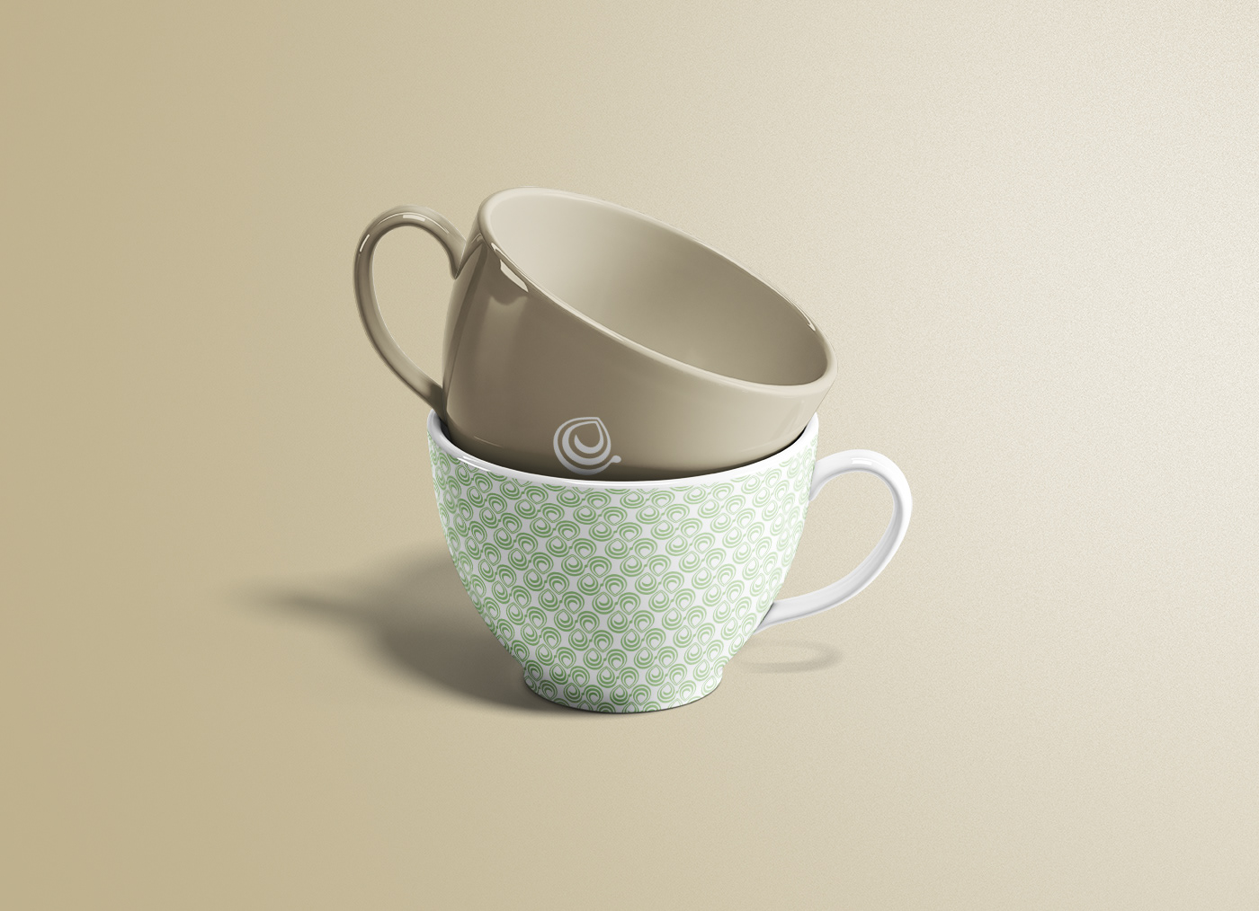
O conceito do ícone se relaciona com o espaço e projeto arquitetônico, trazendo fluidez, movimento e delicadeza, presentes nos elementos naturais, principalmente na água, elemento bastante presente no local e também dos ciclos da vida e seus caminhos que são criados ao longo do tempo.
-
EN
With technology, innovation and sophistication, Ette Dermatology Boutique comes to offer the most advanced in the dermatological universe for select patients who value the best care, result and comfort.
The purpose of the visual identity is to directly represent the glamor and luxury of the space, attributing added value, good taste, subtlety and modernity. Its naming is a palindrome, and can be read on both sides, having the same reading and sound, representing in a limbic way the best version of its patients inside and out.
The concept of the icon relates to space and architectural design, bringing fluidity, movement and delicacy, present in natural elements, especially in water, an element very present in the place and also in the cycles of life and its paths that are created over time.
Desenvolvido para @agenciai10
PT/BR
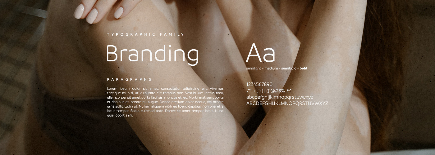
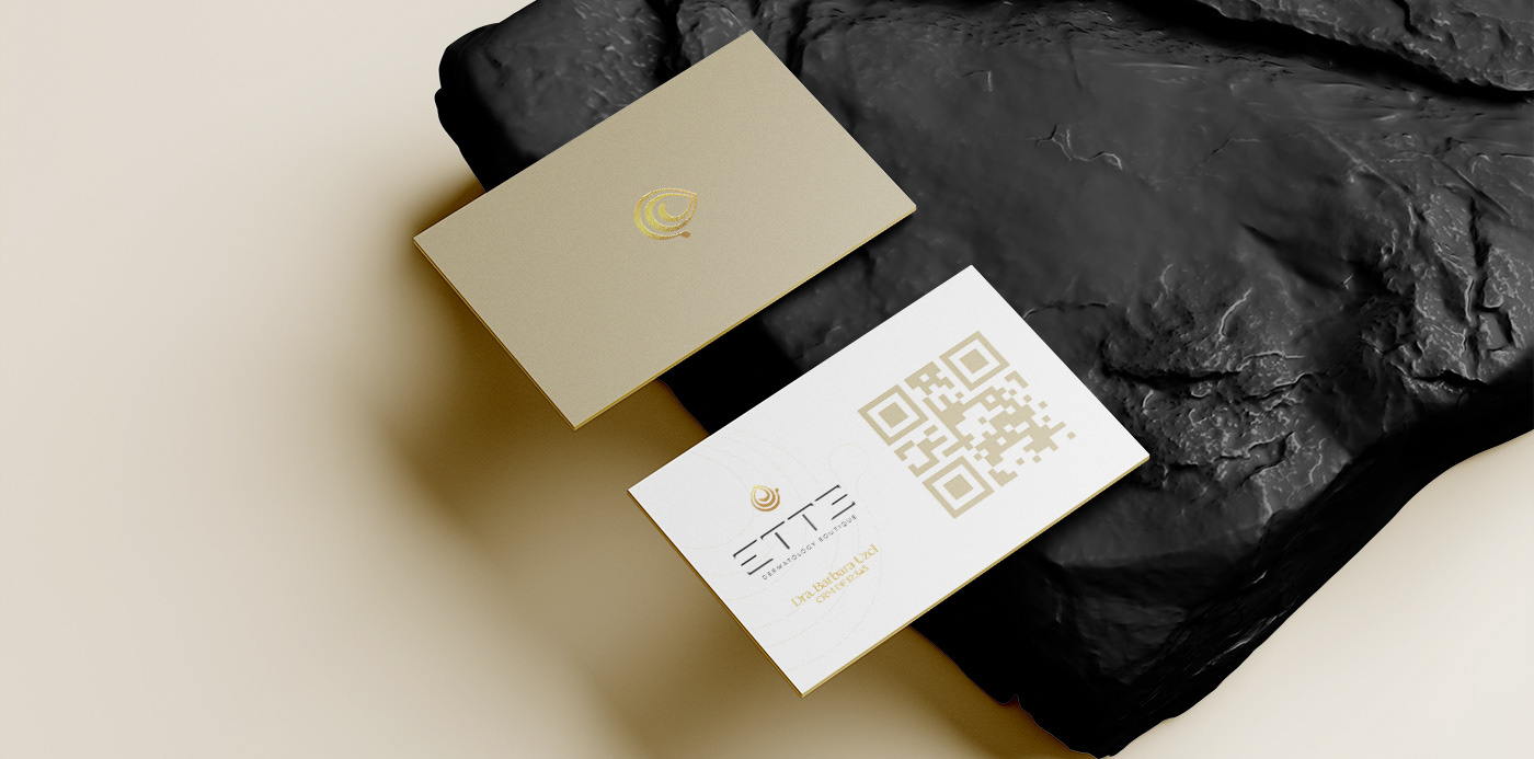
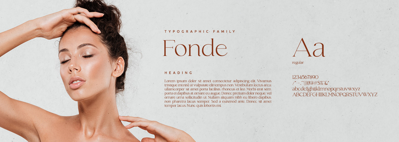
A tipografia no nome "Ette" foi desenvolvida à mão, com o conceito de trazer leveza, fácil leitura e sofisticação juntamente ao ícone. Suas terminações trazem movimento e maior dinamismo na leitura, assim como o "e" final invertido, para apoiar com maior força o palíndromo da palavra, criando uma alusão de reflexo, juntamente com a proposta de proporcionar o melhor tratamento de todas as formas que a clínica se propõe.
-
EN
The typography in the name "Ette" was developed by hand, with the concept of bringing lightness, readability and sophistication together with the icon. Its endings bring movement and greater dynamism in the reading, as well as the inverted final "e", to support with greater force the palindrome of the word, creating an allusion of reflection, together with the proposal to provide the best treatment of all the forms that the clinic is proposed.